Case Study — E-commerce Design
Headers that turn a product grid into a guided journey.
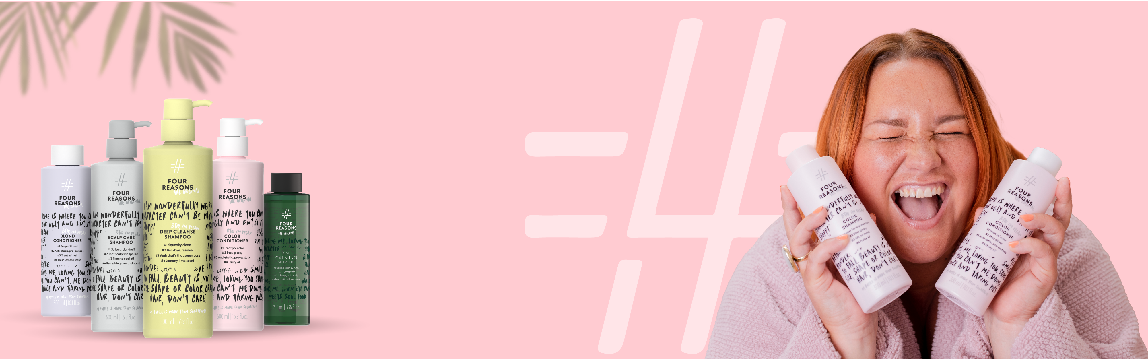
Four Reasons is a playful, body-positive haircare brand — "we love the real you," dessert in the bathtub, undies as a headband. I redesigned the covers and headers for their online collection pages: the banners that greet shoppers at the top of each category and guide them through the brand's bundle offers.
The job was to make a Shopify product grid feel curated rather than catalogued — turning "here are 50 products" into "choose a shampoo, pick a conditioner, add a free gift" — and to design every banner for both desktop and mobile.
Each product line got its own collection cover — a consistent system that lets Original, No Nothing, Professional and Color Mask feel distinct while clearly belonging to one brand.
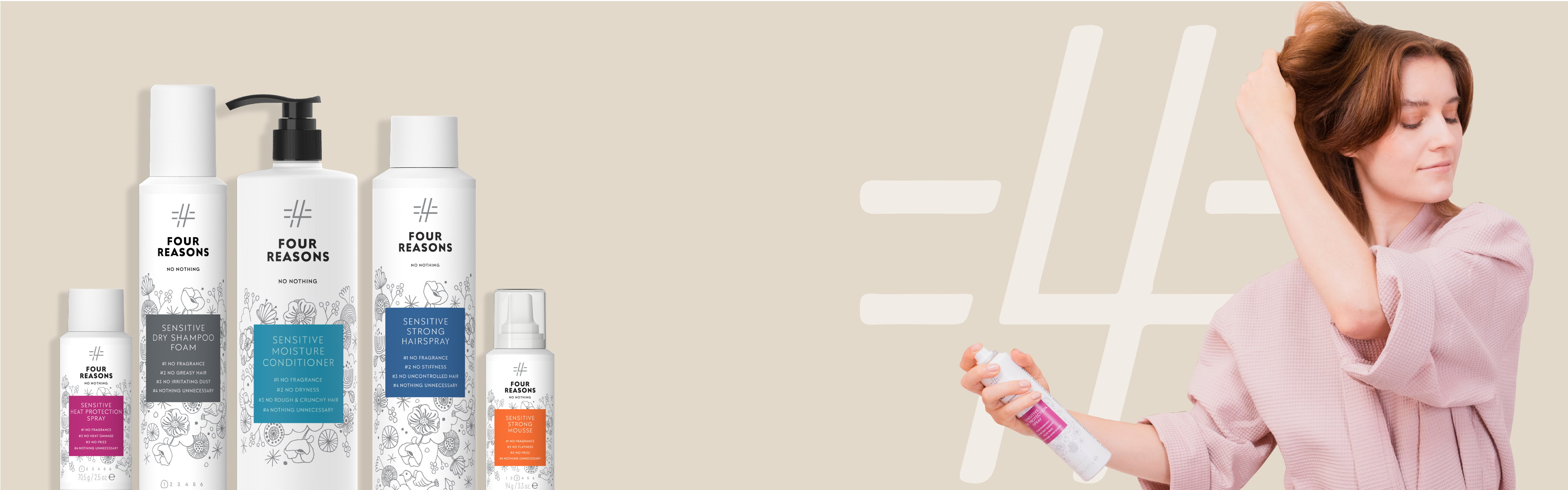
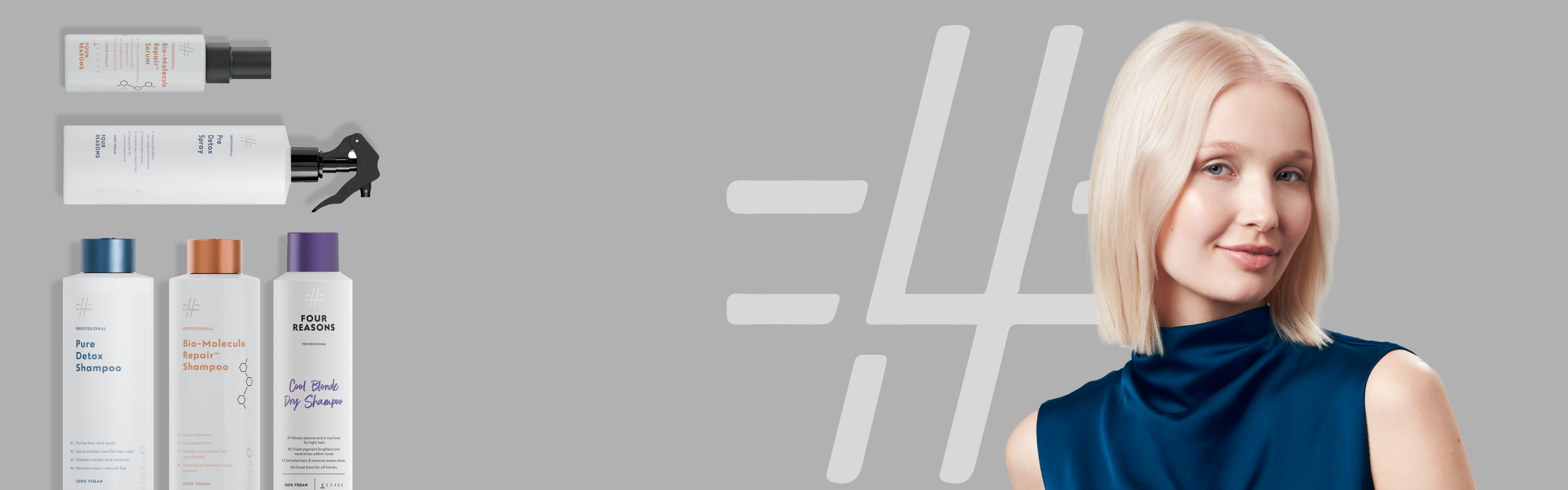
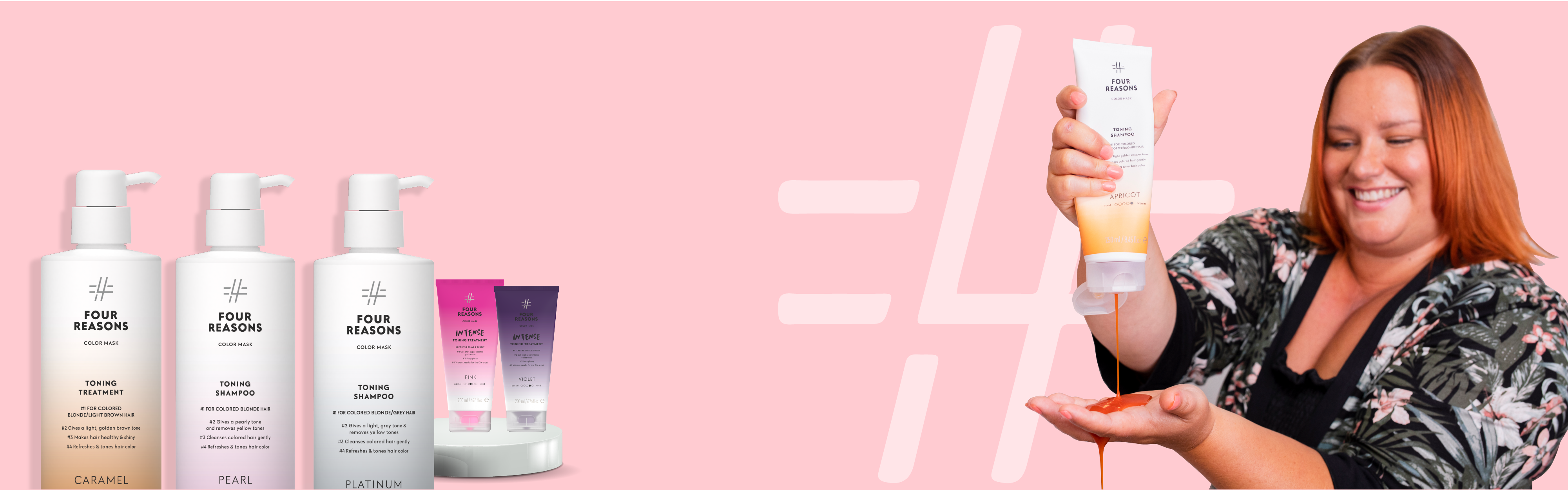
The promotional headers turn the shopping journey into clear steps — choose a shampoo, pick a conditioner, select your styling, claim a free gift — in the brand's hand-lettered voice. Designed as ultra-wide desktop strips and reworked for mobile so nothing is cropped on a phone.




"A good collection header doesn't just decorate the page — it tells you what to do next."
Every header was built for two very different canvases — a near-cinematic desktop strip and a taller mobile frame — carrying the same message and energy across both.
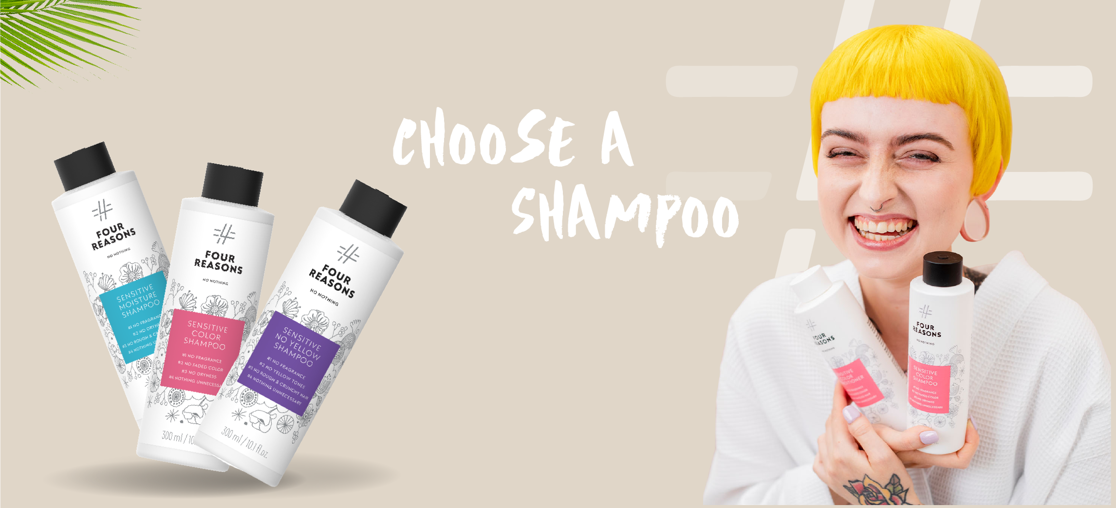
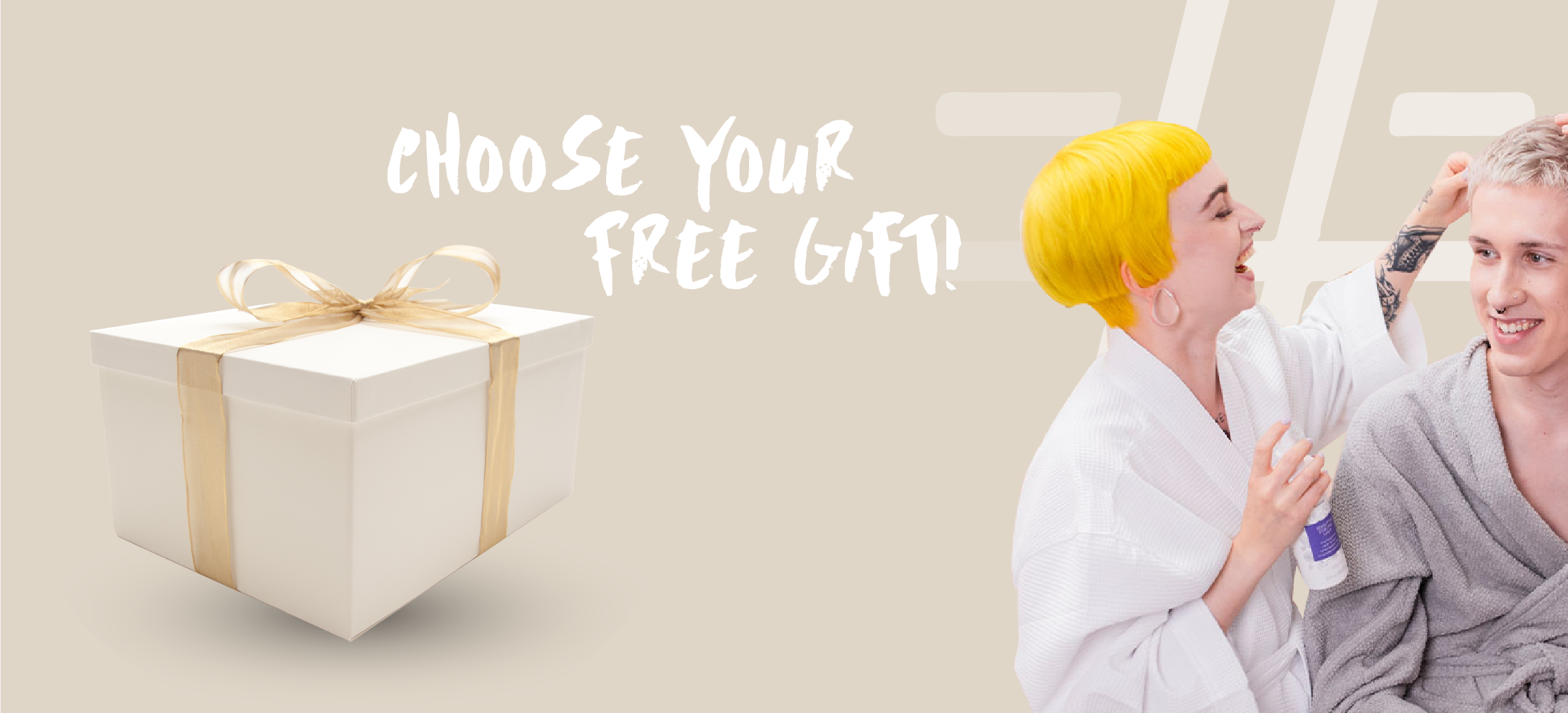
The same headers reworked for mobile
The redesigned covers and headers carry Four Reasons' voice straight into the shopping flow — hand-lettered, warm, and clear about the next step. Each banner frames an action ("choose," "select," "pick your free gift"), so the collection page reads as a guided bundle builder rather than a wall of SKUs — turning browsing into buying while keeping the brand's personality front and centre, on every screen size.