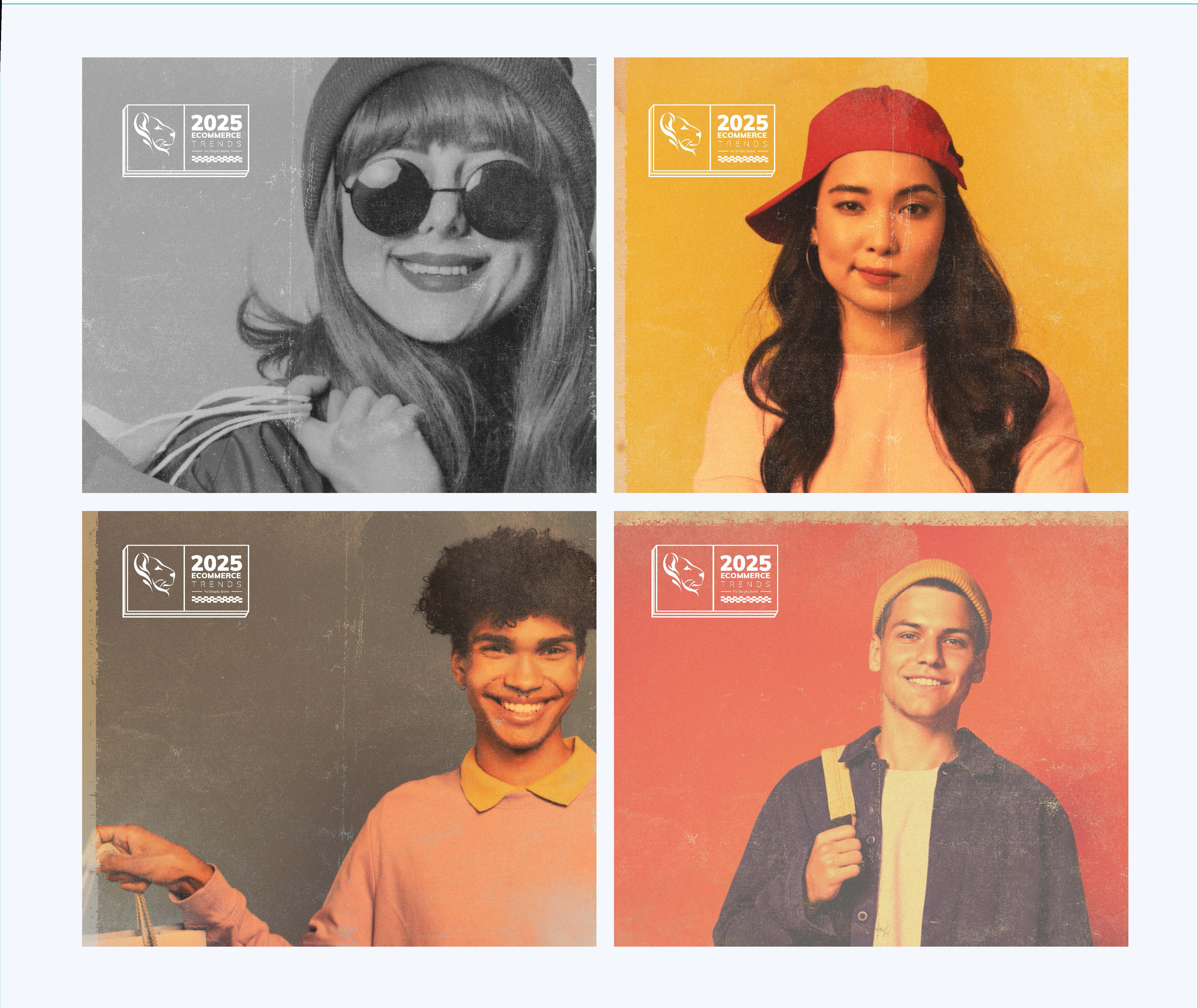
Case Study — Campaign Identity
The trends report that feels like a magazine drop, not a gated PDF.
LoyaltyLion's "2025 Ecommerce Trends for Shopify Stores" report is a flagship marketing moment — a piece of content designed to be quoted, shared, and remembered across the Shopify ecosystem. It needed its own campaign identity: distinctive enough to stand apart from the core brand, disciplined enough to stay unmistakably LoyaltyLion.
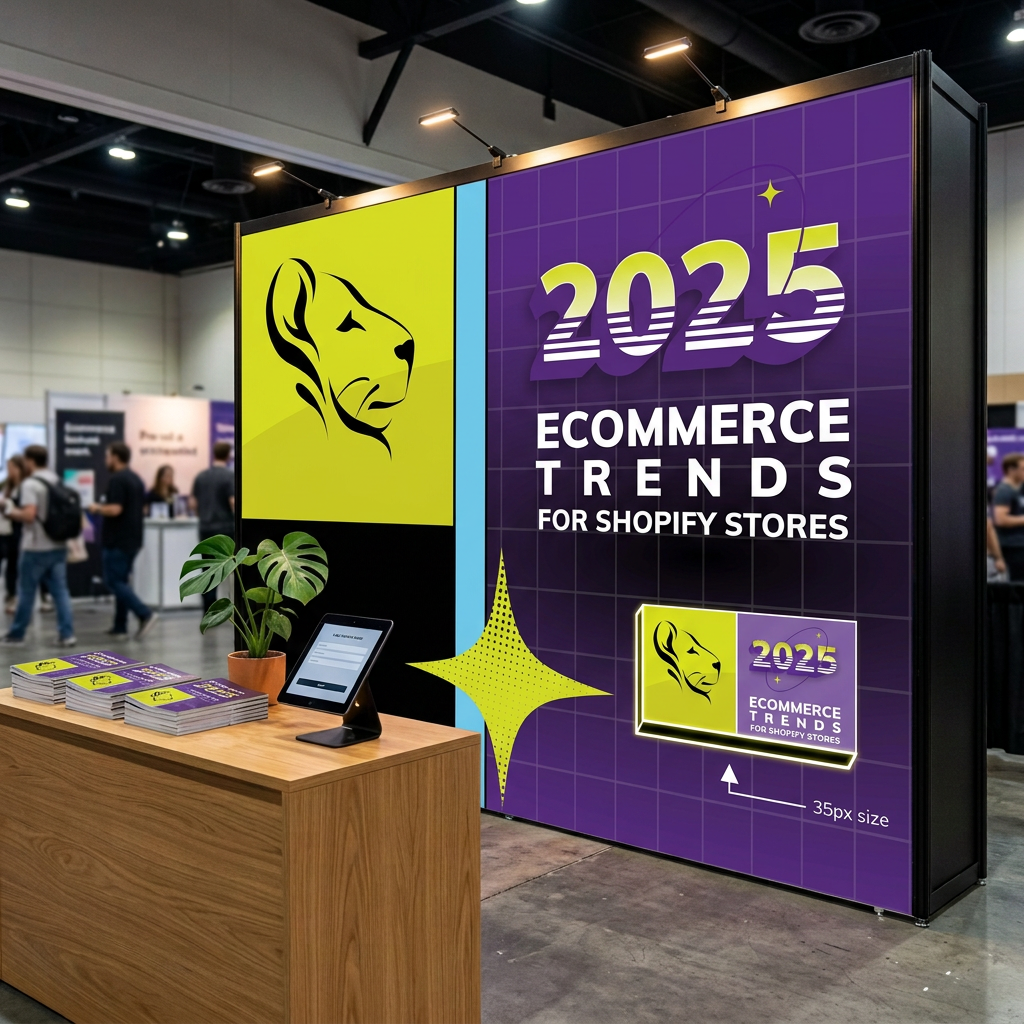
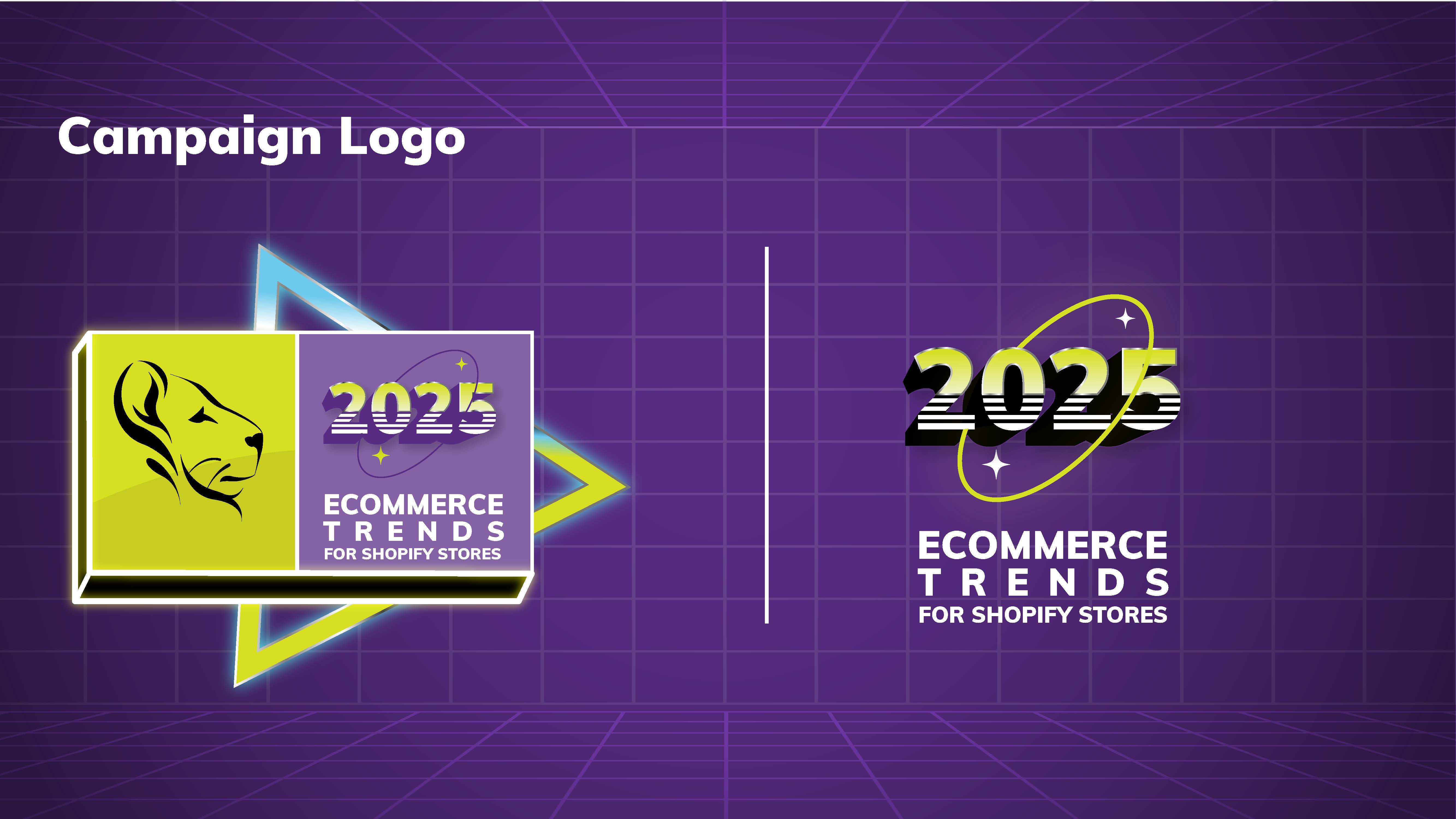
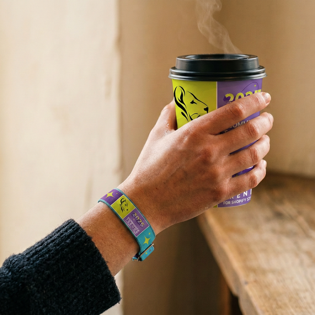
LoyaltyLion is the loyalty platform for Shopify — and this campaign identity is for its flagship annual moment, the 2025 Ecommerce Trends report.
The peer context: every other Shopify-ecosystem tool — Klaviyo, Gorgias, Yotpo, Rebuy, Recharge — publishes a "State of Ecommerce" report in the exact same visual language. Sensible SaaS blue, clean UI screenshots, stock-photo people looking at laptops. Beige on beige.
The territory nobody had claimed: personality-forward, culturally fluent, share-worthy — the trend report that feels like a magazine drop rather than a gated PDF.
For Shopify merchants done with beige trend reports, this is the annual insight drop that treats you like a person with taste.
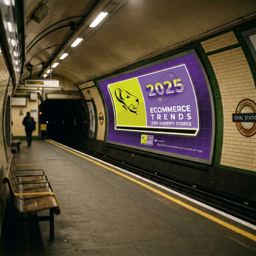
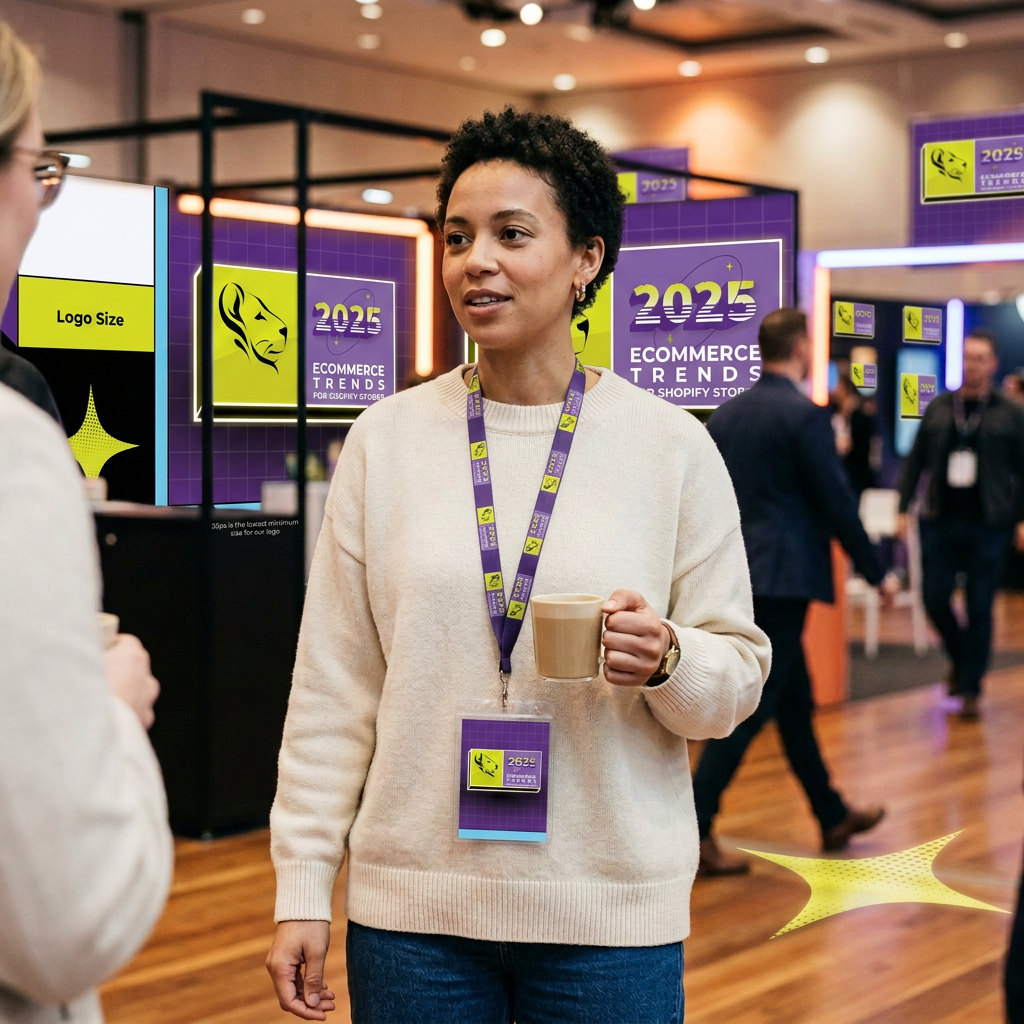
Five deliberate choices define the campaign:
On the spectrum, this campaign sits closer to Liquid Death, Duolingo, Wendy's Twitter and MSCHF than to Klaviyo, HubSpot or Salesforce.
I developed a full campaign brand guide that gave every designer and marketer touching the report the same playbook — so the campaign could scale across formats without drifting off-identity.
The synthwave direction cut through a category of interchangeable SaaS gradients, giving the report a personality readers remember — insight that lands and gets shared because it treats its audience like people with taste. And because the guide codified every element, from halftone stars to logo clearance, the campaign stayed coherent across every asset, no matter who produced it.